
What changed: the Ember redesign
● Current as at 5 September 2026, AEST
If you read these pages when I published them in July, the app in the pictures no longer exists. The features are all still there, and there are many more — but the thing you look at is different. Most of it happened on one day, 10 August 2026. Here is the before and after, including the parts I got wrong in public.
Prefer to watch? Here it is in 84 seconds, narrated, with captions.
The same page, nineteen weeks apart
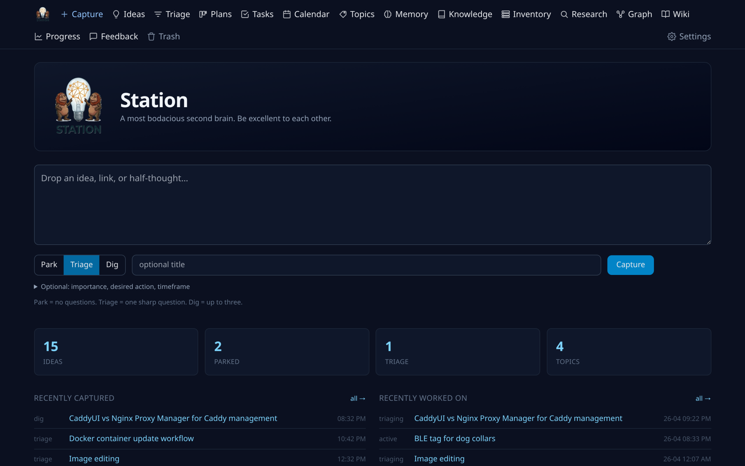
Station’s front page in April 2026, the look it kept until August — cool navy, a row of menus across the top, and a big box asking what’s on my mind.
The same page now.
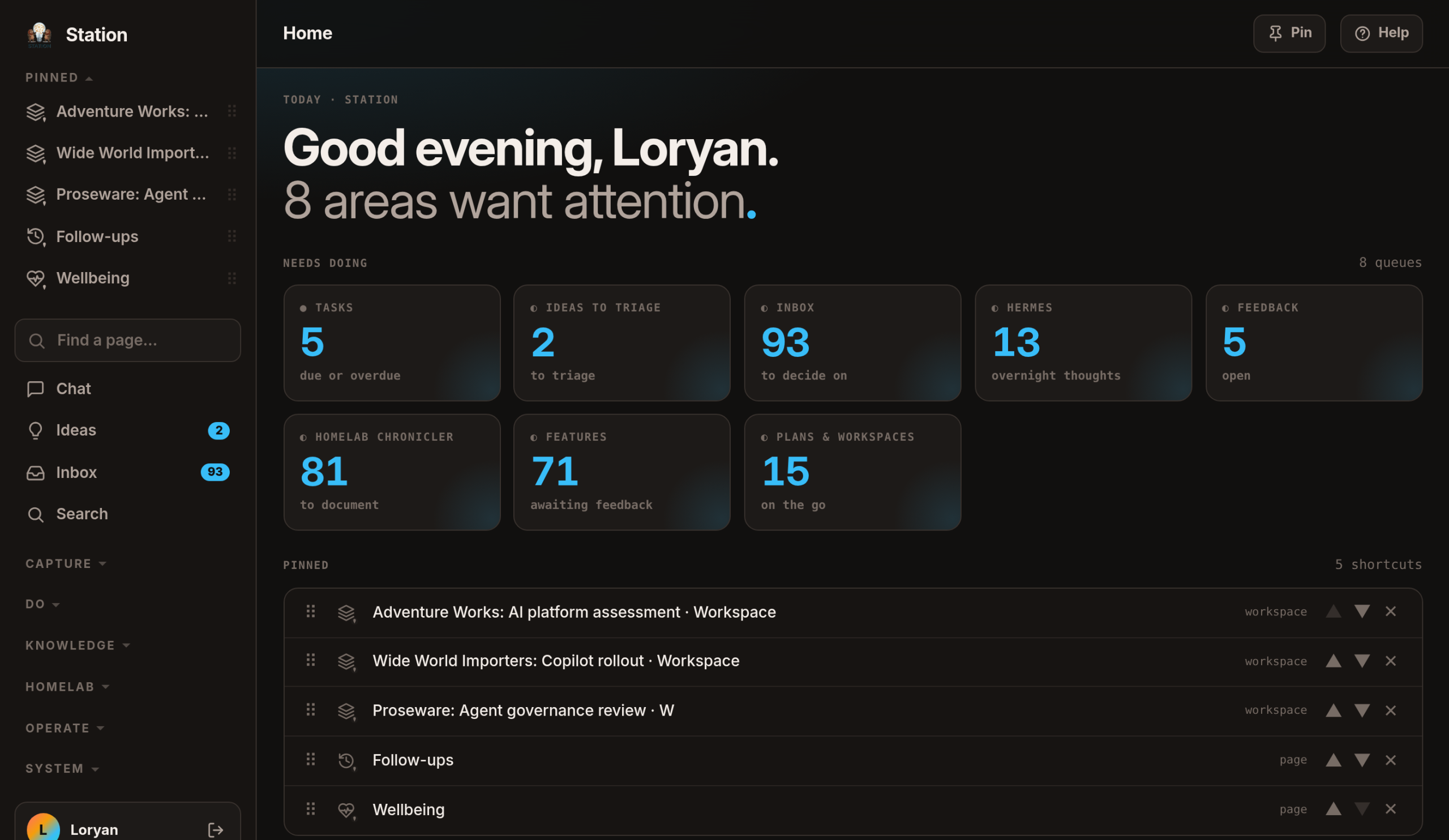
Three things changed, and only one is the paint.
The colour. The old scheme was blue on blue-black: brand, links, selection and charts all spoke in one narrow band of blue, so nothing stood out from anything else. The new one is warm graphite with a light-blue accent.
The box went. It was a copy of the Capture page, spending the app’s best real estate on the third-best route to a feature. And the greeting above it said Good morning at four in the afternoon, because the words were typed in rather than worked out.
The page answers a different question. It used to tell me how much of everything I owned — 412 ideas, 88 tasks, 137 notes on 11 August 2026. True, useless, the same number tomorrow. Now it shows what’s waiting: one block per queue that has something in it, each a link to the page that owns those items. A count never appears without the words for what it means, because 91 alone is a leaderboard and 91 to decide on is a status. Empty queues aren’t drawn at all — a quiet day says "nothing needs attention", where a row of zeroes just looks like a page that hasn’t loaded.
Below that, pins: anything with an address, including a filtered list or one single record, pinned from a button that pins whatever I’m looking at. They sit in the menu and on the front page, renameable to whatever I call the thing.
The forty minutes the front page spent being wrong
It was redesigned three times in 48 hours, and the middle version is mine to own. On the evening of 11 August I replaced the totals with real work queues — right — and rendered each queue as a list of five items. It was in production about forty minutes before I used it and said: "I was hoping for blocks with counts, like it was before, but of the items I specified. It’s too busy and long."
Only real data showed why. The queues that evening stood at 91, 76, 59, 5, 5, 2 and 1. Five rows of a 91-item inbox aren’t a preview, they’re wallpaper; the page ran to three screens; and the greeting added it up to "239 things want doing" — a number that really means "91 emails and 76 undocumented machines", and that nobody can act on. It counts areas now.
The menu moved, then got sorted out
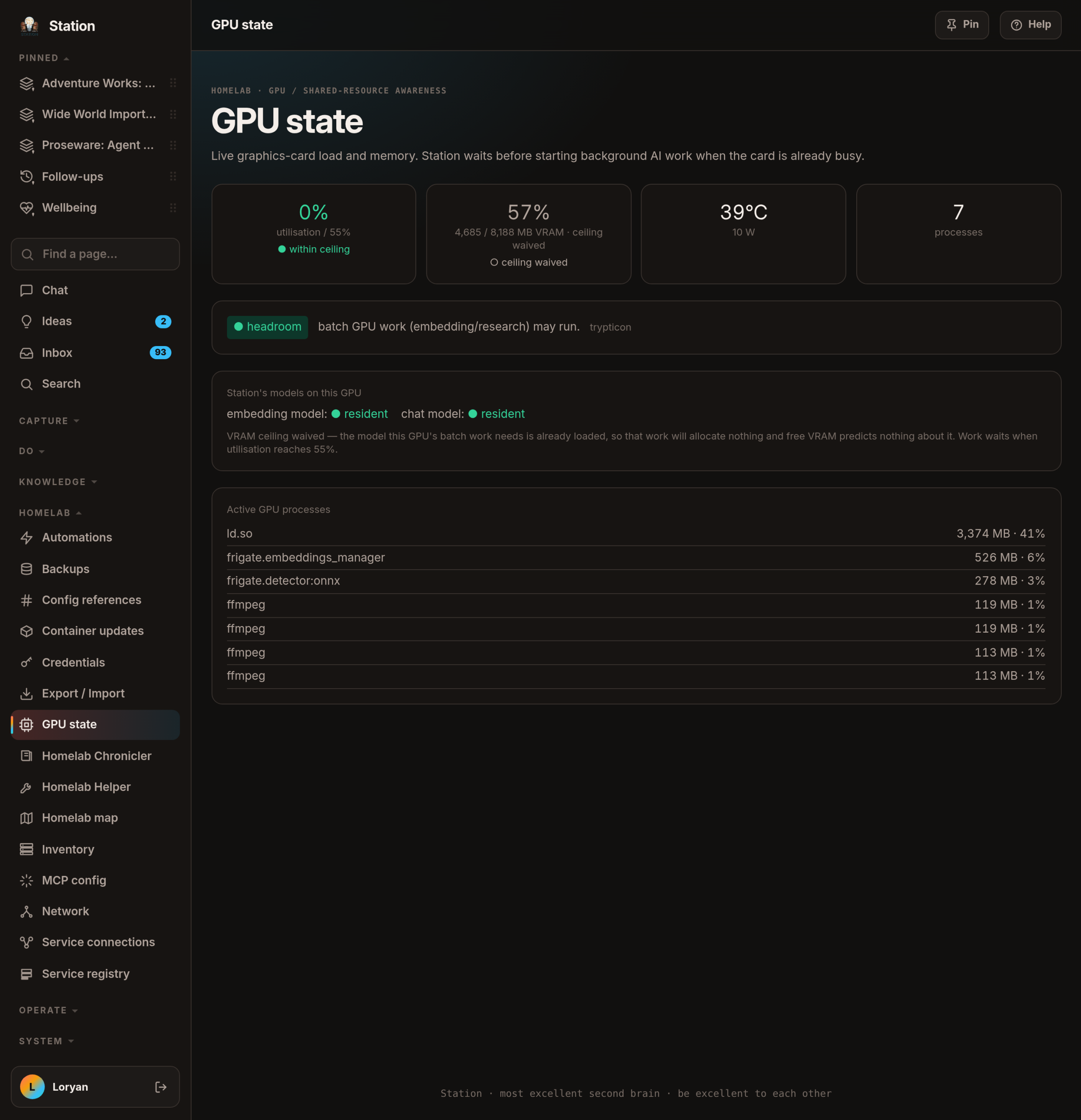
The row of menus across the top became a column down the left, sliding in from the side on a narrow screen. That part was only furniture — same links, new address.
The real change was regrouping them around what I’m doing rather than what each thing is called. "Browse" held a knowledge screen and a rack of servers. "System" was a 21-link drawer holding both "things that run my house" and "settings for the app". Browse stopped existing, the house got a group of its own, System kept only the app’s own affairs. On 10 August 2026 that was eighty-three screens before and eighty-three after — none added, none removed. They were in the wrong drawers.
I got it wrong twice on the way. Emptying one junk drawer immediately built another. And the ten pages indented under Inventory were un-indented the next day, once I checked what they actually read: six of the ten have nothing to do with the inventory. They lived at a similar address by historical accident, and the menu was repeating that accident as if it meant something.
Find a page, and find your way back
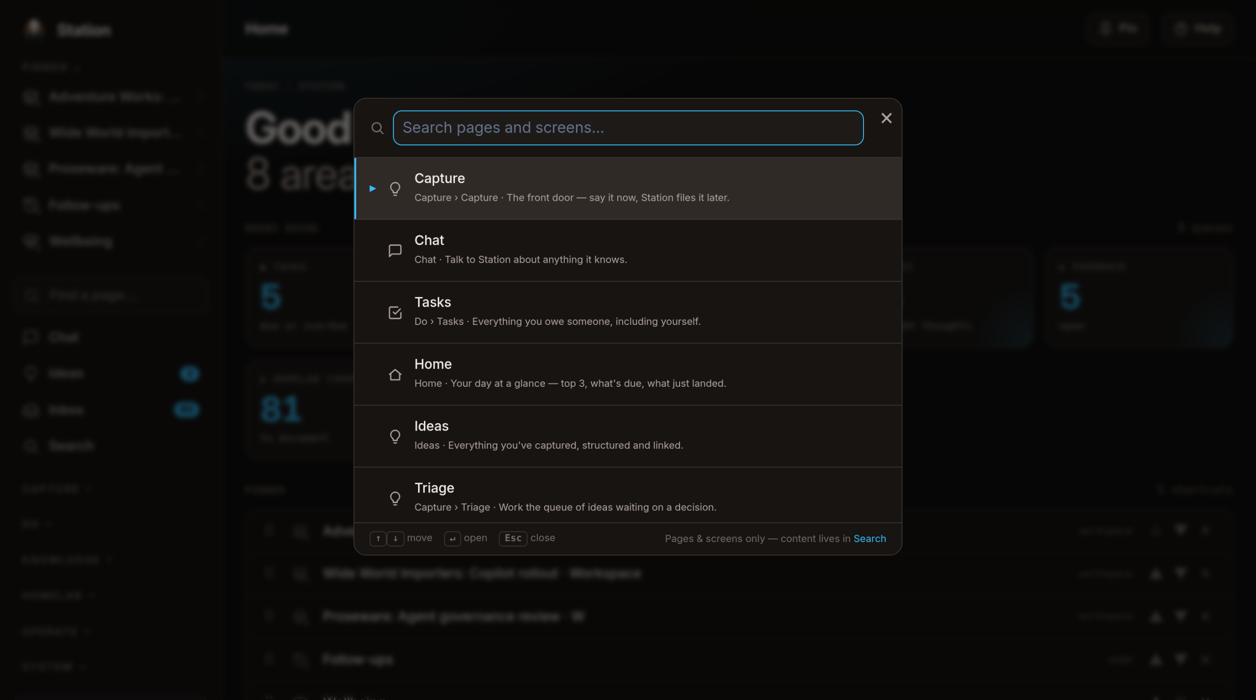
By late July 2026 there were about ninety screens in Station and roughly a third of them were in no menu at all, so I added a shortcut that jumps straight to any of them. It searches on the words you’d actually type rather than the ones I chose, and shows the path to each, so it teaches you where things live while you use it. It used to open from a pill in the top right — diagonally opposite the menu it navigates. It’s a menu; it lives in the menu now.
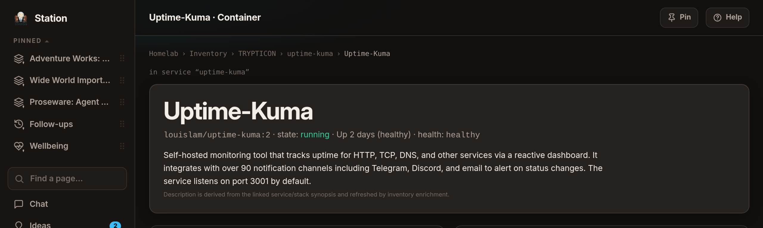
Every detail page used to carry one back-link, hardcoded when Station was an idea box and a thing had exactly one home. But a task now lives in a plan and a workspace, and turns up on the calendar, in search and on the map. Open a task from a workspace and the page pointed you back to Plans — a section you’d never been in. My note at the time: the only way is the browser back button, which is not ideal. The trail is now worked out per visit — the group, where you actually came from, the thing itself — and on a phone its middle folds to a …, because one readable parent link is what you reach for, not five truncated stubs.
Shapes and words, never colour alone
I’m colour-blind, so the rule across Station is that nothing tells you anything with colour alone. A status is a shape and a word: ● done · ◐ running · ○ inactive · ✕ failed. That isn’t bolted on at the end — it’s the constraint the redesign had to fit inside, and it chose the colours.
The look I was shown had a coral accent, and coral is very nearly the app’s error red. With hundreds of links beside a hundred error messages, links would have read as errors — for everyone, and worse for me. So coral was ruled out for anything carrying meaning, and kept only as decoration on the menu. Its replacement was a bright pink; that shipped, and after three days I gave the check-in one line: "Not a fan of the pink colour on buttons." It’s a light blue now, which is also far easier to read — on 13 August 2026 dark text on the accent went from 5.4 to 8.9, against a bar of 4.5.
On 3 September 2026 the rule went back through the whole app: calendar, job runs, research, monitoring and inventory now pair every glyph with a plain word, icon-only buttons got names, and controls that only appeared on hover — useless on a touchscreen — stay put.
The phone
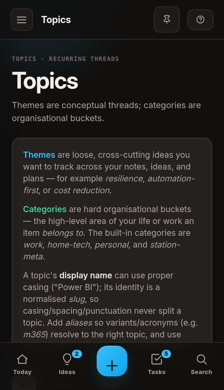
Station’s pages had a phone-width layout written for them — stack the title above the buttons, shrink the heading, let a long row of actions scroll sideways — and until 13 August 2026 nobody had ever seen it.
It had never once rendered. The rules sat about 180 lines above the ones they were meant to override, and at equal strength the later one wins — so all three had been dead since the day they were written. On a real 390-pixel screen those pages still laid themselves out in two columns; one scrolled sideways by 414 pixels and an intro paragraph came out one word per line.
What kept it invisible is the part worth taking away. Something else in the same block worked fine, so the block was evidently working. And no check had ever actually rendered anything at phone width: the tooling reported the width we asked for while quietly laying the page out at 800 pixels. About forty pages visibly changed on the day it was fixed — though not all of them: one was still scrolling sideways by 153 pixels when that work shipped on 13 August 2026, and dozens of others share the same latent shape. Every page is now checked at 380 pixels by a browser that has to prove its own width before it is allowed to check anything else.
Two more things that were wrong for months in plain sight
The browser tab said Station — Bookmarks · Station. Two reasonable pieces of code were both adding the app’s name — the shared page frame at the front, 44 individual pages at the end. Neither was wrong alone; together they put the word on one screen three times, under a logo that already says Station. Nothing would have caught it: a page title is the one string nobody re-reads.
Twenty-five places printed the time ten hours wrong, for months, while every test stayed green — because the tests checked the tool that converts a time and nothing checked the page. A footer reading "captured from a recording at 09:30" really meant half past seven at night. Since 31 August every time a person sees is written one way (4:30pm, 3 Sep) from one place, and anything that calls or prompts me runs on my phone’s clock rather than the house’s — the evening call set for 5:45pm had been ringing at 3:45 whenever I was on the other side of the country.
A day of colour, a day of furniture, a week of small corrections — and what made that survivable was boring. Before any of it, every hard-coded colour in the app was replaced with a name that points at a colour. After that, changing the whole look meant editing one short list, and undoing the pink meant editing eight lines and nothing else. Everything else on this site was photographed after all of it, so the pictures and the app finally agree.
Where the app came from, and how much of it there now is: Origins and growth →. A walk through it as it stands: the grand tour →.